TIMELINE
January - August 2022
TEAM
Michelle Kou
Michelle Tran Bui
Isaac Wen
Sarah Chang
ROLE
Designer
Summer Project Lead
DISCIPLINE
Visual Design
UI & UX Design
Interaction Design
CONTEXT
PROBLEM SPACE
Overcoming Human Errors
For Food Roots: With a large number of orders coming in each week, the ordering process—including updating inventory, managing spreadsheet formulas, keeping track of delivery dates—are subject to human error.
Spreadsheet is a hassle
For Clients: Frustrating to order using a spreadsheet as it’s easy to place orders in the wrong cell and hard to filter through the available produce.

THE QUESTION
How can we enhance the order management system to reduce errors and improve the efficiency of delivering produce for clients?
DESIGN CONSTRAINTS
We were informed of important constraints before we work.
Before we began building the proposed solution for Food Roots, our project leads had several scoping calls with the APIFM organization.
Order Deadlines
For an order to be delivered by a certain date, users need to order X days and hours in advance so that APIFM has time to fulfill the orders.
Calendar
FOTC has one person as an IT Manager, so designing a flexible and thoroughly debugged system is critical to ensuring the apps enduring usefulness
No Search Bar
For an order to be delivered by a certain date, users need to order X days and hours in advance so that APIFM has time to fulfill the orders.
Produce Filtering
FOTC has one person as an IT Manager, so designing a flexible and thoroughly debugged system is critical to ensuring the apps enduring usefulness
COMPETITIVE ANALYSIS
In order to gain inspiration and feature ideas, we performed a competitive analysis on 8 grocery/produce delivery apps to compare and contrast features and note strengths and weaknesses to better inform our own designs.

We noticed 4 prevalent feature details across the different apps:
Many apps have adopted a subscription model for products that a user would need frequent shipments of.
Users typically are able to save favorite items or access previous purchases through an order history or “buy again” page.
Some apps with more limited stock only allow orders for the coming week. If an item is only available on certain days, changing the delivery date prompts a warning message.
Visually, white space is necessary to help reduce clutter and the user’s cognitive load, especially on screens like the marketplace that contain a great number of products.
USER INTERVIEW
What would the end-user want?
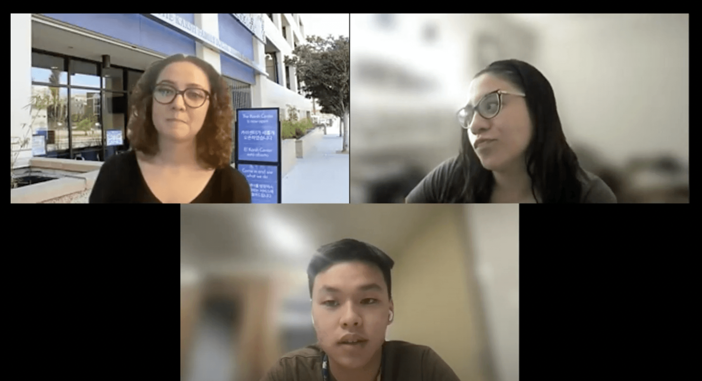
In order to thoroughly understand the users’ current experience with the organization, we conducted 5 user interviews with Food Roots users: restaurant owners, chefs, NPO organizers, and cooking instructors. Each 30-minute interview consisted of general questions about their current experience working with Food Roots, such as:
Why do you order with Food Roots?
During what days or occasions do you order produce?
Can you walk us through your current process of ordering with Food Roots?
After we wrapped up our user interviews, we drew an affinity map to group our findings into categories such as delivery patterns, tech literacy, order frequency, and purpose, just to name a few. Through examining these categories, we were able to identify common themes and recurring trends, using them to extract key problems to prioritize.

MAIN INSiGHTS
1. Order dates don't change that much, but quantity and contents of order does change occasionally.
2. Users want to be able to see more items at once and to select frequently-purchased items easily.
3. Users want to see which produce are available and see faster updates.
4. Customers use Food Roots because it aligns with their values of supporting their community.
KEY FEATURES
We identified 4 key features for the marketplace.
Place recurring orders that are editable, accomodating for changing demand.
List View + Favorites
Enable quick scrolling to view multiple items at once. Allow users to select favorite items quickly.
Filter
Easily identify seasonal items without the use of a search bar.
Community
Reinforce community support by including all farmer's names.
USER PERSONA + USER FLOW
Based on the key insights from the user interview, we created a user flow and user persona to better understand their specific needs and solve through feature ideas.


UNEXPECTED CHALLENGES + IMPROVEMENTS
Setbacks and a new direction for repeated orders
After speaking with Food Roots, we were faced with an unforeseen challenge.
- Because of limited staff, Food Roots can only deliver on Mondays and Fridays.
- Since produce availability is always changing, users could not order one week in advance, making repeated orders or subscriptions difficult to implement.
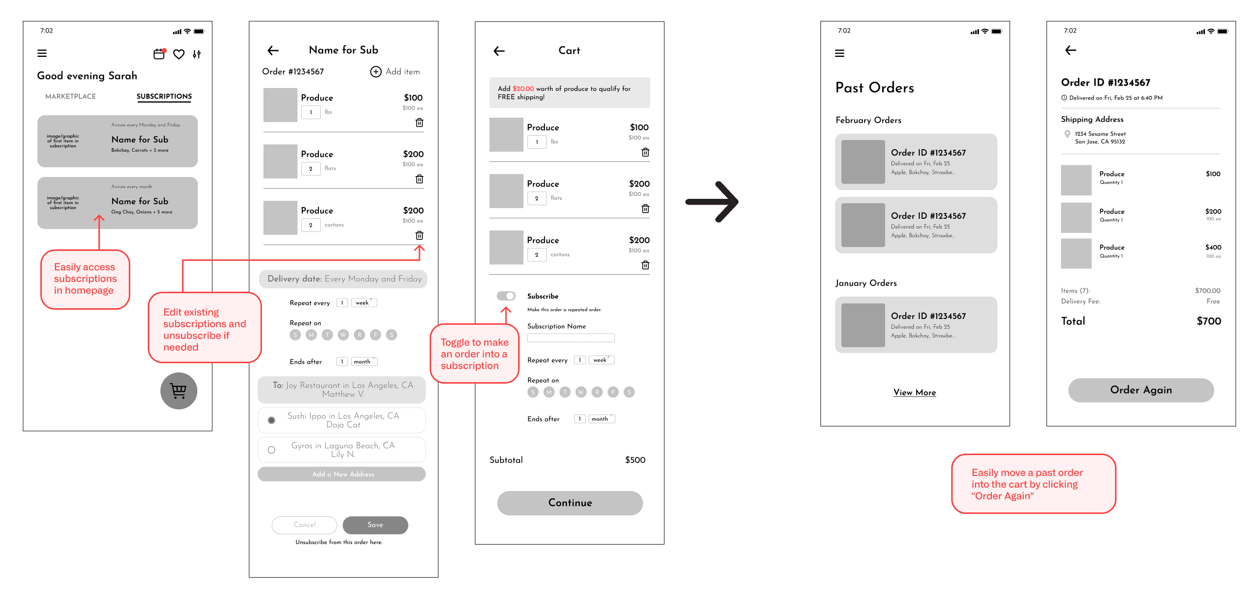
Thus, we had to repurpose our subscription feature into a past orders page that enables users to edit and reorder previous purchases.

USABILITY TESTING
How would the user interacted with the app’s core features?
Upon making the appropriate changes, our team was able to recruit 3 participants for usability testing. Ideally, we would’ve liked more participants, but since the app is only meant to be used by Food Root’s existing pool of customers, there was a limited number of users we could potentially recruit.
Our usability test consisted of a series of tasks that tested how the user interacted with the app’s core features. These tasks included:
Add a list of items and their specified quantities to the cart.
Favorite items and switch to list view.
Filtering for only seasonal produce.
Editing order content and quantity from the cart.
Access, edit, and reorder a previous purchase.


FINAL SOLUTION
Set up a Delivery Date
The Deliver Date pop-up allows the user to select a desired delivery date of the week; the marketplace will display the available produce according to the date.
Filter & Sort Produce
Filter and sort a catalog of produce items and easily navigate through the marketplace. The "seasonal" filter is essential for items that are in stock based on the season.
Browse and Add items to the Cart
Browse the produce items by toggling between list & box view, adding to favorites, and clicking each produce to add to the cart
Finalize & Checkout
See the cart and add or edit the delivery address before checking out all the items
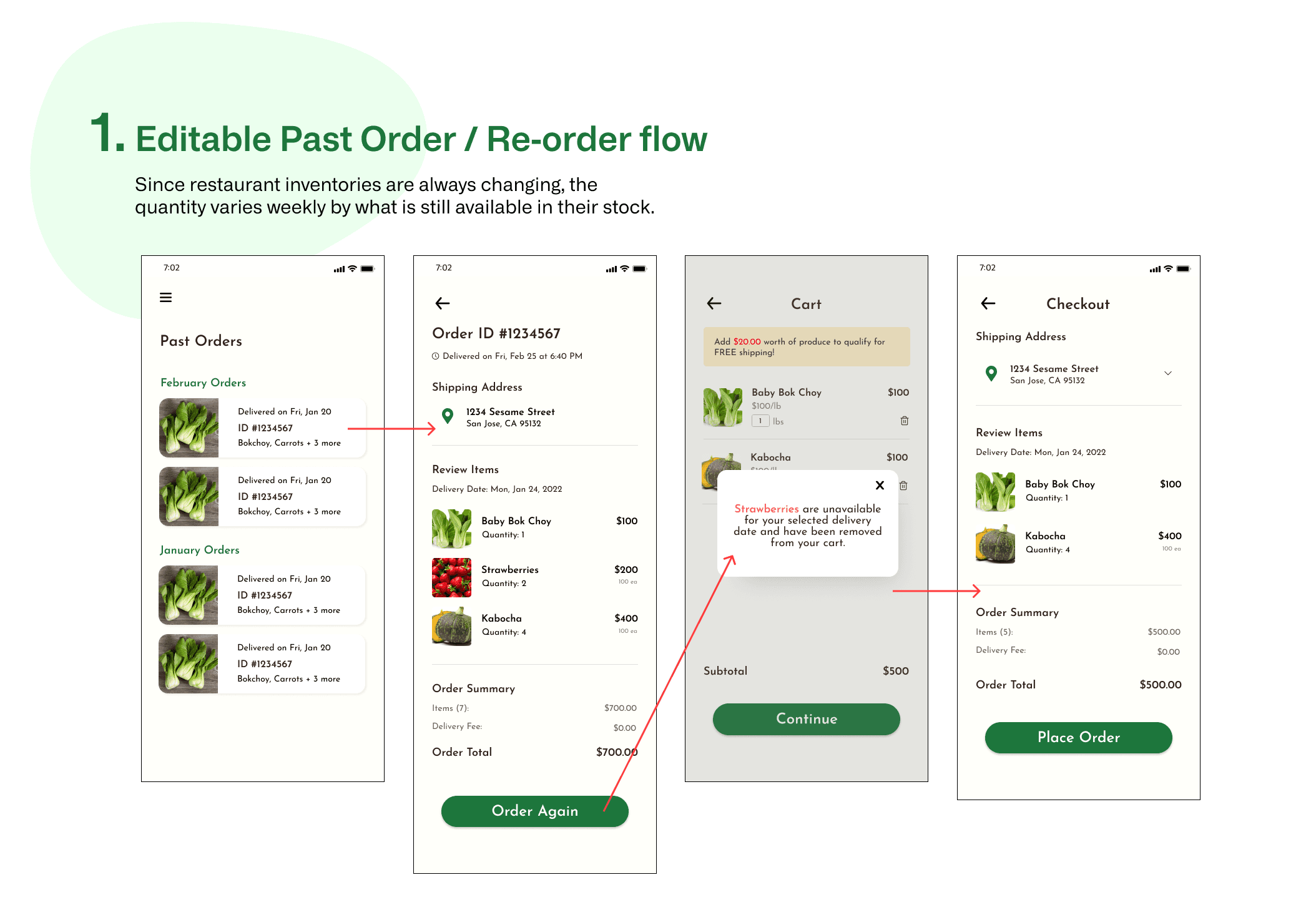
Easily order again
Access past orders instead of manually adding all the items again and edit the items accordingly to add to the cart
Style Guide

Reflecting Back…
Dev - Design Collab
Bridging the gap between designers and developers ensured that our shared vision translated seamlessly into code. Regular stand-ups and open dialogue not only improved our workflow but also enriched my appreciation for the intricate synergy between design aesthetics and technical feasibility.
Functional Design
Engaging in functional design forced me to delve deeper into user behavior and needs. As I mapped out user flows, I realized that each design element carried a purpose beyond aesthetics. This holistic approach taught me to create designs that not only look appealing but also enhance usability and guide users intuitively, leading to more impactful user experiences.
"So What?"
In the midst of a design iteration, a usability testing session revealed an unexpected block. Users were struggling to understand the delivery date feature. This 'Aha' moment emphasized the significance of user testing and how even the most meticulous designs can benefit from real-world validation. It highlighted the essence of user-centricity, inspiring me to be more proactive.
THANKS TO
HUGE shout out to my APIFM team for guiding me through my first client-based UX design experience and always bringing laughter and smiles to our worksessions.


